VISDOM

Visual software diagnostics

VISDOM

Project

Visualisation is a powerful method for communication, especially in cross-disciplinary communication with various stakeholders, as in operations.

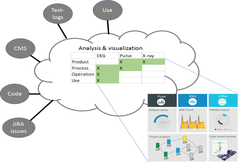
Many software development tools already provide some visualisations, but integrated views that combine data from several sources are still at research prototype level. The VISDOM project will develop new types of visualisations that utilise and merge data from several data sources in modern DevOps development. The aim is to provide simple “health check” visualisations about the state of the development process, software and use.

Innovation

Visualization using several data sources

DevOps projects typically use number of tools and many of these tools include visualization components. One of the unique innovations of VISDOM project is to create new visualizations that utilize data from several tools.

New types of visualization, health-check metaphor: EKG, blood-pressure, pulse, X-ray

For example EKG: Software projects typically include various repeating tasks and iterations, such as sprints or delivery cycles. Such phenomena can be shown as repeating visual patterns, similar to the rises and falls of an EKG curve. Problems will be quick and easy to spot as variations in the patterns and especially difference between planned and real state. Based on our earlier research we assume that under such conditions the status of a development organization can be efficiently monitored by following repeated graphical patterns. In the VISDOM project we plan to create both research prototypes and industry-relevant implementations of this concept.

Stakeholder-specific dashboards

The project creates a configurable dashboard concept that can have different content and views to different stakeholders. This concept has been visualized in below. We will also create prototype dashboards for the pilots, and the companies may exploit these dashboards by integrating them in their current and future development support tools. A dashboard is not necessarily just for direct presentation of data, but it can also include diagnostics tool and help the stakeholders to investigate possible problems in their projects.

Innovation

Workpackages

Workpackages

Technical workpackages

WP1: Prestudies and requirements

WP2: Data collection, aggregation, processing and analysis

WP3: Visualizations

WP4: Demonstration, experimentation and validation

Supportive workpackages

WP5: Exploitation and dissemination

WP6: Project management

Publications

From Monolithic Systems to Microservices: A Decomposition Framework based on Process Mining
Research
D Taibi, K Systä
9th International Conference on Cloud Computing and Services Science, (CLOSER 2019)
Software Usage Data Visualization
Master's Thesis
Hugo Fooy
Tampere University, 2019
Software Factory Project for Enhancement of Student Experimental Learning
Research
A. O. Muhammad, K. Liukkunen
Proceedings of 16 th International Conference on Cognition and Exploratory Learning in Digital Age CELDA 2019. Cagliari. Italy. ISBN 978-989-8533-93-7. p. 297-306.

Partners

Invenco Oy
Finland
Qentinel Oy
Finland
Softagram
Finland
Vincit
Finland
Tampere University
Tampere, Finland
University of Oulu
Oulu, Finland
Océ
Netherlands
TIOBE
Netherlands
University of Groningen
Netherlands
Experis ManpowerGroup, S.L.U.
Spain
Polytechnic University of Catalonia
Spain